Welcome everyone!
It's high time for a new Poster and a new design! I know you weren't expecting, but here's the new Poster! :P There is no need to rest on your laurels, and you have to constantly create new ones :)
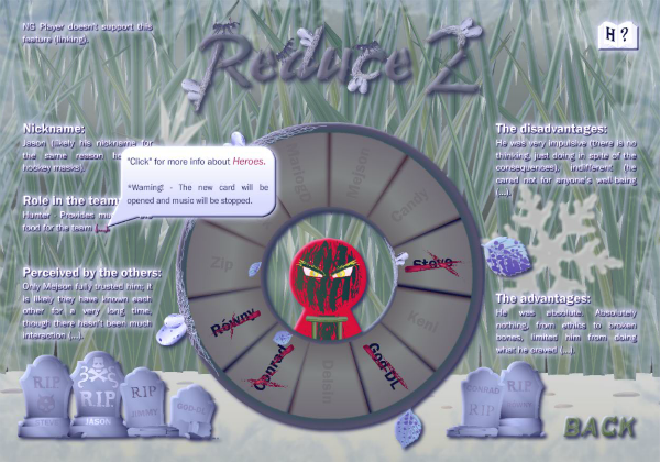
Here is Reduce 2 - Pass of Time, to be exact, its main menu. As you can see, it has been adjusted and I added various effects to suit the climate of... the inevitably approaching winter (in the world of Reduce), which will have an impact on the heroes :P
I would like to know from you what you think about:
- new look and inscriptions - is everything legible,
- character descriptions (from R2 - Summary) - did I 'trim' them well (because they won't fit in full version, of course),
- in the upper right corner (as on the screen) there is a book icon, which is two buttons: one is a link to R2 - Summary (to learn more about characters - full descriptions), and the other is Ailment (for a specific hero),
- information balloons - show descriptions and behavior of buttons (two - one per button), whether they are understandable.
What do you think about it, @Cyberdevil, @Animetion24, @MariogD, @SayMeBott and @Mazurek? I updated both the swf in the project and the exe file, so feel free to watch and opinion :)
Regards,
Mejson
Cyberdevil
The white text on that background hmm... it does feel maybe a bit difficult to read, maybe easier if the text was white entirely, possibly with a shadow outside it? The black that blends in doesn't make it easier I think. On the wheel maybe the names are a bit dark before you hover over them too, otherwise looks good... I like the idea of winter in the Reduce world too, feels new?
I like the book and bubble too, really stands out but in a good way, reminds me of old software interfaces a bit. I miss those old pop-over tips.
Overall nice! Maybe one more thing: the way the old Extra menu fades before the new one's presented, does that need to be there? It's like it disappears just as you're about to click it - maybe doesn't need to have that transition for ease of use.
Mejson
Forgive me... my friend for not writing back yesterday, but I was engrossed in corrections to the project XD
The third case (which you mentioned) has been working / has been around forever and nobody has complained... so sorry to say it will stay that way. All others will be corrected as much as possible :)
Yesterday we had a meeting where we discussed the project :) Here are the fixes that are needed:
- adding a LOGO (yes, this logo) at the beginning of the animation (with the 'Skip' option of course),
- improving the visibility of the text (adding the 'Glow' brown color),
- I changed the info text (in character selection) to SELECT
'NICKNAME (also dead)', because I have the impression that the observers did not click on 'tombstones',
- I added a tooltip to '(...).' as they are now active objects to explain simply where the data is,
- I added (in the upper left corner) the information 'NG Player doesn't support this feature (linking).' So that the observer knows that the linking will not always work and not to blame us for this. @Cyberdevil, can you confirm it doesn't need better wording?
Also, @Cyberdevil, could you please check the meaning and correctness of this text for me? That's it:
'Events the expansion (this animation) begins when our heroes are separated by an unfortunate ambush by zombies. The group who not broke through must retreated... Keni, Mazurek, Zip and Rash. Could they truly hide? Whether they will survive?'
The above text will be used for a cool item in the main menu :P Thank you in advance!
I have updated SWF / EXE.