Welcome everyone!
After your great correction / help in the previous Poster, I am impressed :) I am always proud of you! How are you? Ready for the weekend? What do you usually do on the weekend? In the new year I have to prepare / buy a new job... because I am already afraid of my neck from sitting at the computer...
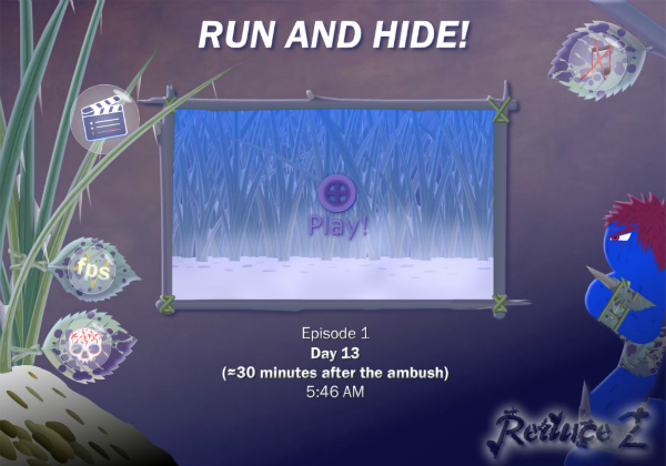
This Poster shows the Scenes selection screen during animation. As you can see, it has been quite modernized, not only visually but also informatively.
Changes that have occurred:
- removing buttons for Auto Quality,
- removing my stupid texts under picture XD,
- adding information about the time to the scene (under the picture),
- removal of additions to the title / scene name.
I think ("RUN AND HIDE!" In this case) should be uniform without any unnecessary ornaments. What do you think about it? Was it childish before?
What do you think about it, @Cyberdevil, @Animetion24, @MariogD, @SayMeBott and @Mazurek?
Regards,
Mejson
Cyberdevil
Ready indeed! It's time to catch up on everything there's no time for on the weekdays! XD Way too much computer here too, do wonder how it'll affect posture long time...
I think it's good. :) Looks good; text works well too. Don't really remember the text before this but it's definitely good like this, simple and easy to survey, and a title that makes you want to watch too!
Mejson
Possible! :P I guess you can't add comments to your own projects (only reply to observers), you got away with XD You won't have to do it anymore :P
It's great that you like it! :)