00:00
00:00
Mejson
FLASH WILL NEVER DIE WHILE WE'RE ALIVE!

Age 37, Male

Senior Software QA

Second degree IT studies

Kozienice, Poland

Joined on 7/27/08

Level:
60
Exp Points:
38,760 / 100,000
Exp Rank:
265
Vote Power:
10.00 votes
Audio Scouts
1
Rank:
Master Sergeant
Global Rank:
1,123
Blams:
2,696
Saves:
5,257
B/P Bonus:
28%
Whistle:
Normal
Trophies:
13
Medals:
273
Supporter:
3y 7m 25d

R2 - Pass of Time (ChordC's Music - Tip)

Posted by Mejson - December 30th, 2020


iu_216976_2525285.png


Welcome everyone!


I'm sorry that I didn't add Poster earlier (I was going to), but today I was busy helping and doing chores at home since morning :P Now I'm adding :) How are you feeling, my friends? :P


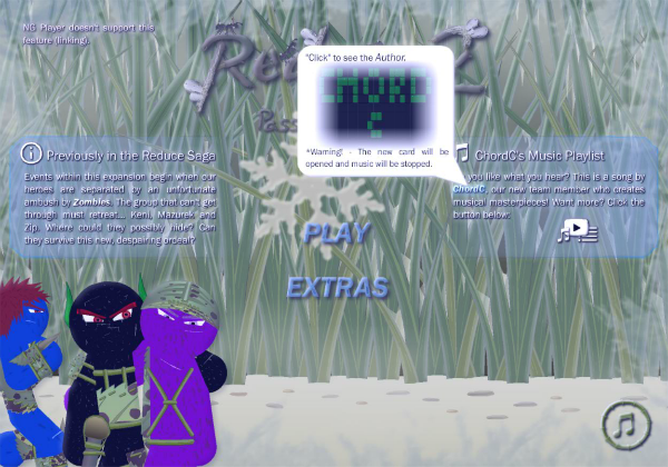
This Poster is about the first part of ChordC's Music Playlist (so that you can freely listen to all the songs of our music artist) :) Namely the show 'Tip' and a button that takes you to a special screen (where you will be able to choose / listen to these masterpieces). I am currently working on the second part of ChordC's Music Playlist (this screen).


As you can see, there is an informative text (which has already been verified) and a link (a cloud - you can go to the NG profile) and an elegant button that takes you to the mentioned screen. That's all... it's a fairly small update (from the point of view of the work devoted to), but please! I wanted you to see.


What do you think about it, @Cyberdevil@Animetion24@ChordC@MariogD@SayMeBott@Mazurek and Rashty92?


Regards,

Mejson


Tags:

5

Comments

It looks pretty good :), I appreciate the page that you made for me, really :D. Anyway, as always, take your time with the animation, it's a tedious process for sure.

Thanks! I try to make it look nice and fit :) You deserve your own screen in the project :) Well... sometimes I encounter problems that I have to solve, but it's an interesting and addictive process of creation, because I love creating 'new' things :P

I wonder if this sentence is correct:

"Click" to see the Author.

What do you think about it?

This looks great. :) Bit tired but good I think!

Regarding the click message maybe something like:

Click to open author's page
Click to see author's page
Click to visit userpage
Click to open userpage
Click to open ChordC's page
Click to visit ChordC's page
Click to go to ChordC's page

Thank you! Nice!

I choose: "Click to open ChordC's page."

I have mixed feelings about this screen - menu and title is disappearing. Too many stimulus / informations how for me |:

Eeeee, thanks for the comment... I think so.

Sounds good. :) Regarding the focus on the menu disappearing... it's true maybe... seems more noticeable in a small preview like this, but if it is a problem maybe the menu items could be bigger, or a stronger color? Or possibly the text boxes a bit smaller or less notable instead... it's a good size for readability though...

Bott* likes to have a different opinion than others, everything fits perfectly and is supposed to create the effect of such a blur because this is the weather that is represented by the Main Menu... so there's nothing to change - it's perfect. :P

Ah alright. XD It sounded like you agreed below though!

Nope :P Bott* nice to see you! :)

@Mejson how this section is opened? Is this @ChordC part on the right always displayed in the menu?
Don't You think that @SayMeBott and @Cyberdevil have a point? Maybe it is better to have this @ChordC music part as one of the opening screens? Before menu? When you click Play?

'everything fits perfectly' -> yes that is true but @SayMeBott and @Cyberdevil mentioned that maybe there are to many elements, not that they are wrongly placed.

Privately you showed me another page, when you can choose music. I was expecting seperate page for @ChordC music. Did I understand You wrongly?

@MariogD, @SayMeBott, @Cyberdevil, opens when the "Open" button (the icon representing it) is clicked. This "Tip" is displayed in the same way as the one on the left (hides when it is supposed to cover something).

I don't think they are right. One of the opening screens? Before Main Menu / after clicking Play? Absolutely not. There are too many more screens and it will cause irritation because the user will have to wade through the next screens, and he wants to go to the animation ... so this is the best solution. It fits and is pleasing to the eye - the user will click as he wishes.

There are not too many elements, it was the same in Reduce 2 - Summary. This is full use of space.

You click the button and a new screen appears (covers the Main Menu).

@Mejson your words makes me sad... First you ask about opinion, then you 'think' that you thank for comment...

No, I don't 'like to have a different opinion than others', I like to have my own opinion.

What when one person sees something, and another two confirm it (@Cyberdevil <3; @MariogD <3) - just ignore, 'all be fine'? What about all viewers, what if they have similar opinion and after premiere give 3 instead 5?

@SayMeBott, my words weren't meant to make you sad...

It's good that you have your own opinion - it's important.

As I mentioned, this solution worked well in Reduce 2 - Summary. It is elegant and does not cover anything at all, and the distances between the elements are large. Moreover, such 'Tips' are often used in games and are also great.

@Cyberdevil and @MariogD, spoke up about it because you mentioned it and they started overthinking / thinking about it: "Maybe yes, maybe not". This is really a minor accessory that "decorates" the animation and is not so important to call it "everything" because we always correct everything if it is wrong... You are exaggerating... they will give 3 because they don't like 'Tip'? If a given element does not cause a failure, it is not even mentioned by the viewer... Maybe relax because you have become very agitated...

Regarding the menu, looking at it a bit more... personally I'm fine either way.

I don't think it's a visual detriment as is. Until you open up the tooltip it doesn't feel cluttered per se, the boxes and text both having the same tone of blue may make them float together a bit but in full resolution I don't think anyone can really miss the main menu items either way.

I do think it would be possible to improve further with some kind of contrast or size difference, but it does work like this too IMHO. It may not be a change worth the time. I did indeed not really think about this until @SayMeBott mentioned it, but the strife towards perfection feels like a worthy cause. :) It's probably a good thing someone plays
Devil's advocate, and has opposing views that challenge the way we see things; make us aware of things we wouldn't be otherwise.

Anyway, in conclusion: whatever you decide on it's all good. Though I do appreciate the extra eye @SayMeBott. Props on speaking honestly; saying how you perceive things. Good reminder to maybe be a bit more attentive sometimes. Even if it doesn't result in a change: good to have different perspectives.

Cool! Nice to hear it :P Thanks!

Well, this was the intention to fit the whole thing. If there was something more or less distinct, it would spoil the whole / coarse effect.

I think there is no need to combine with the Main Menu because you have to do more things / elements :P Cool, @SayMeBott looks quite strict with the eye, it's actually good :)

Yes, cool :) But honestly... @SayMeBott should express his opinion on an ongoing basis, it would be fun! I suspect there is no time...

Good to hear. :)

Indeed, time often seems like the big issue for most of us!

Anyway as the hours tick down too it's just a short while left to say: Happy New Year, to all of you! Looking forward to seeing how the story progresses in 2021; hope it's a positive year for all of us! A bit less pandemic; a bit more progress; maybe in time lots of extra time. ;)

Hi! How are you feeling in the new year? How was it? New Year! Super optimistic, I hope! Fire and Ice! Let the force be with you! Karamba! Once, once... Thaaaaaranakuaaaauuuu! :P (some random sticky XD letters).

Well maybe not THAT optimistic, but I was pretty optimistic last night! XD Stayed up a bit late though so currently more so tired again. XD But yeah! Woo! Let's make things really happen with this one!!!

That's good! Since I have been exercising (about 10 days), I feel great mentally and bad physically sore (muscle pain) XD But that's good, because you need to exercise to feel good about your body shape and health! :) I've been sleeping only a little for 2 days because I'm working on animation and I help at home :P

I thought you wouldn't write to me :P Hehehe, today is 1st January :P From today you have slack for a year :P Hehehe

Too true. :) Took a longer walk than usual today - time to ease into a little bit better exercise routines this year! And the muscle soreness means the muscles are actually growing too. ;)

No plans on slacking at all this year! XD Just changing focus/priorities/trying to get things in order, for sure, I guess I'll start now! :) Good luck with everything; see you around a bit later on!

It's nice that you also exercise / walk :) It's good for you :P

Uuuuu, very ambitious :P I understand, and what will you be doing / what will you do? Cool thanks! A new Poster today! xD

Hehe, well for now I just need to prioritize my own work; get some stuff out of the way. :) My site, another mixtape, some smaller collaborations... shan't delve to deep into the feedback on the new now but it really looks good! Nice work!

Well then you have some tasks :P I respect! Thanks!