Welcome everyone!
Due to the fact that these are only minor updates recently, so don't wait too long with new ones :) So it's time for another Poster! Go, go, go!
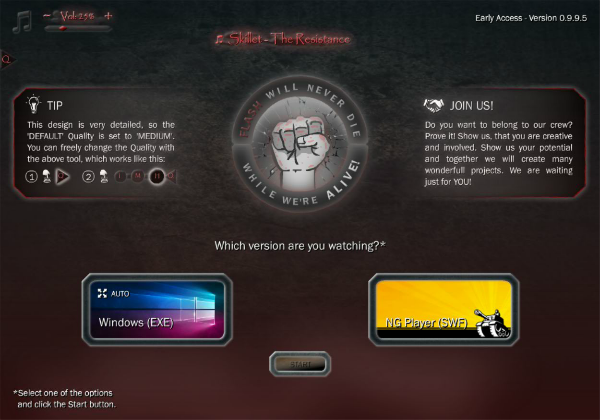
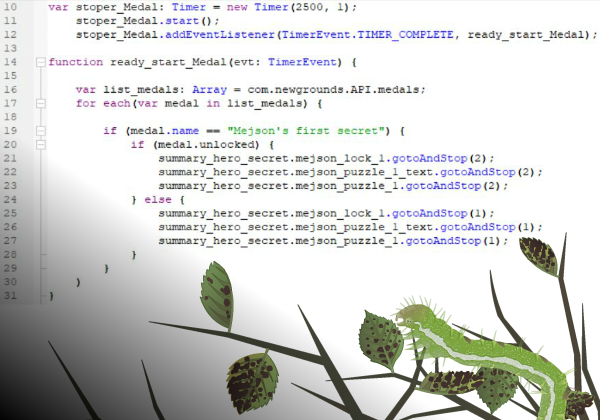
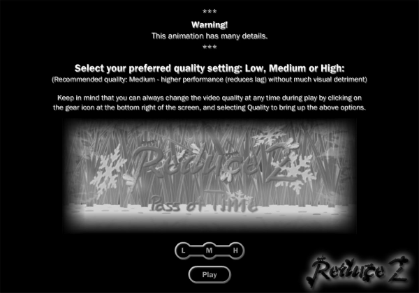
Before you, the selection screen of Animation Quality, i.e. the choice (quality) made, will be during the entire animation, unless you manually change to another one :) This time without any experimental solution, like failure - Auto Quality XD... P But there is no need to mention the failures :P Forgive me I was trying to combine something with Quality.
This board allows you to set the whole animation to the quality: Low, Medium and High :) (each quality is presented in the form of a different photo, which adequately represents the quality - different levels of blurring of the image) As far as I know, @Cyberdevil will be happy because he can set 'Low' and he will have this quality until the end of the animation :)
Please check if the text is correct:
***
Warning!
This animation has a lot of various details.
***
Select the movie quality display between: Low, Medium or High:
(Suggested quality: Medium - can prevent lags and visually not much different from High,
but significantly improves watching.)
What do you think about it, @Cyberdevil, @Animetion24, @MariogD, @SayMeBott and @Mazurek?
Regards,
Mejson